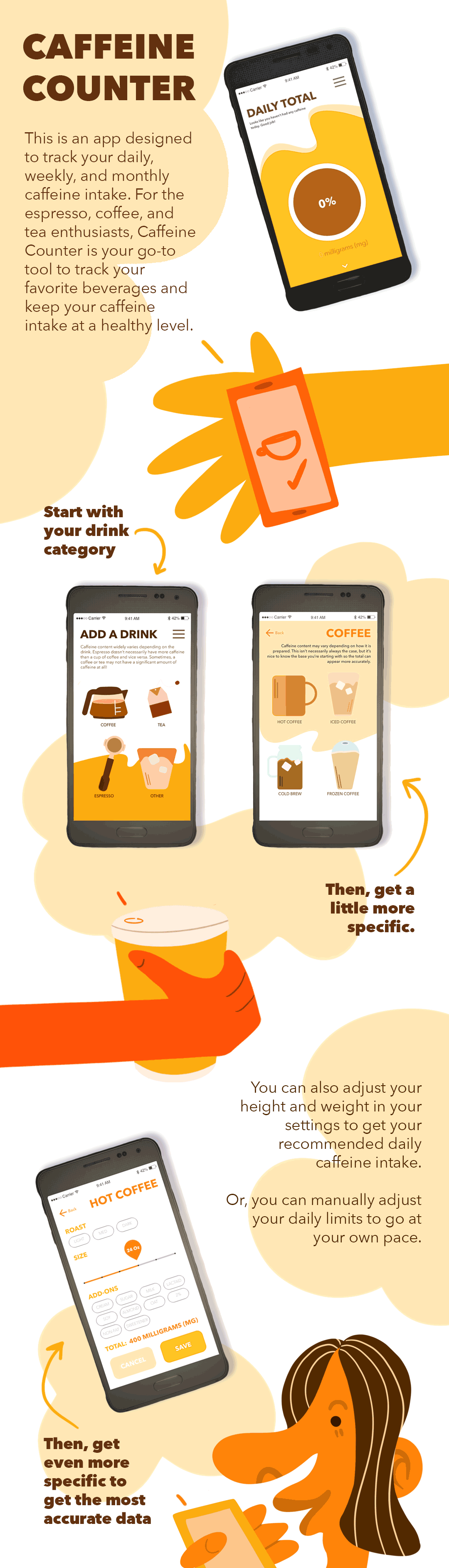
Here is a video walk through of the prototype. As you can see, I made a conscious effort to include as many drink categories as I could, while making sure each page was not a pain to scroll through.
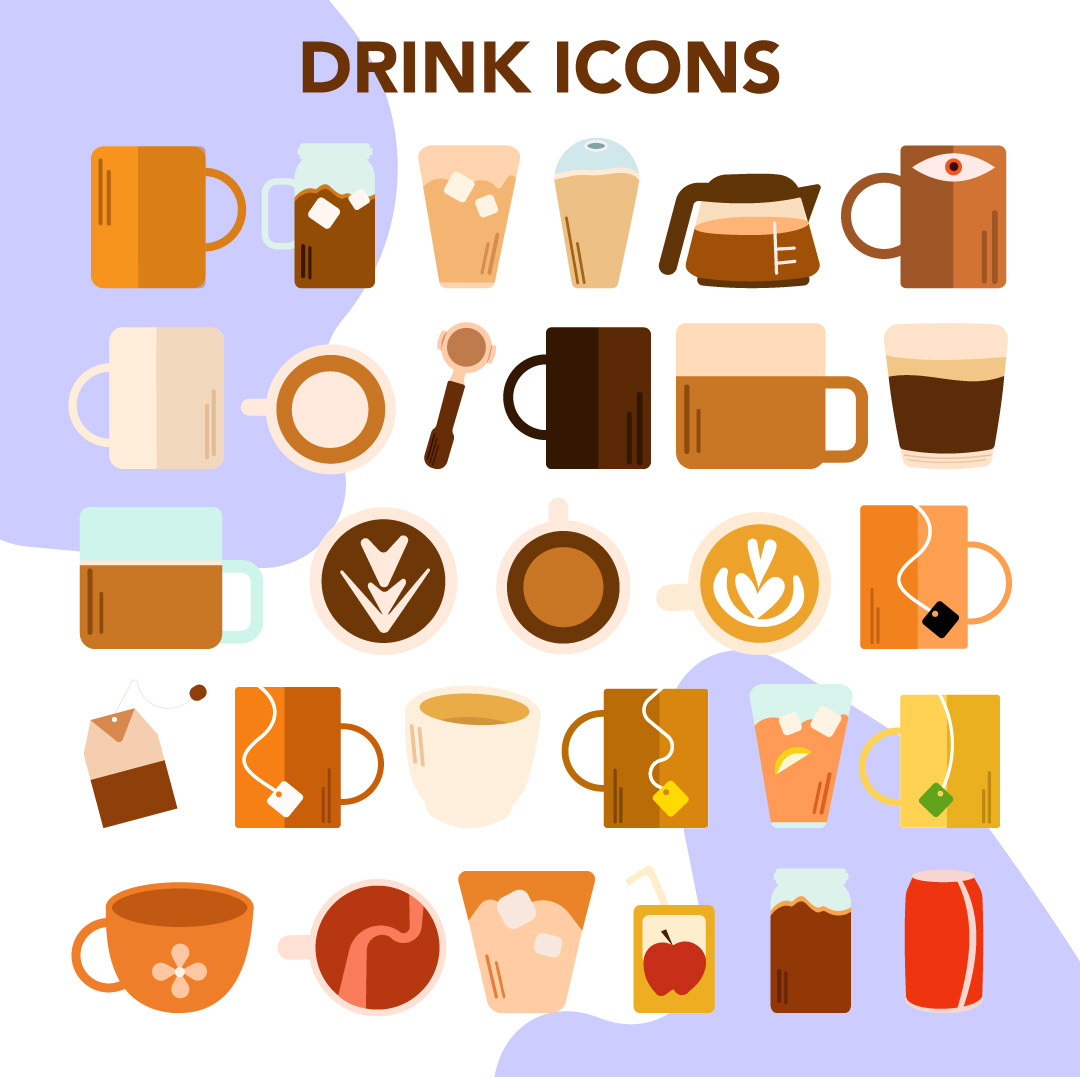
One of the most enjoyable aspects of this project was creating several clickable drink graphics. It was a fun challenge to visually distinguish certain drinks from others, especially when it came to the espresso drinks. There are minuet differences between cortados vs. macchiatos and mochas vs. lattes.
As a fun additional element, I made this logo for the fake company that "commissioned" the app to be made. In order to create a more cohesive style in the prototype, I designed the app with a fake company in mind. I created a logo graphic for this fake company, which I called Two Ounces. I chose to give the logo a bouncy and fluid animation to communicate a more fun and trendy design style. I wanted it to look modern and professional but also I needed it to maintain a more playful side.
