![](https://cdn.myportfolio.com/8414dadd-0bd1-436d-8fae-bae28eed6ffb/c50a95a6-2205-490c-8333-9c62a45866b5_rw_1200.gif?h=70be92c466bd074181dd234458f187d9)
![](https://cdn.myportfolio.com/8414dadd-0bd1-436d-8fae-bae28eed6ffb/5ba073a6-c1ed-4627-a856-9677471a1b5a_rw_1920.png?h=058e3615ccf550862bc36be1b6188ae5)
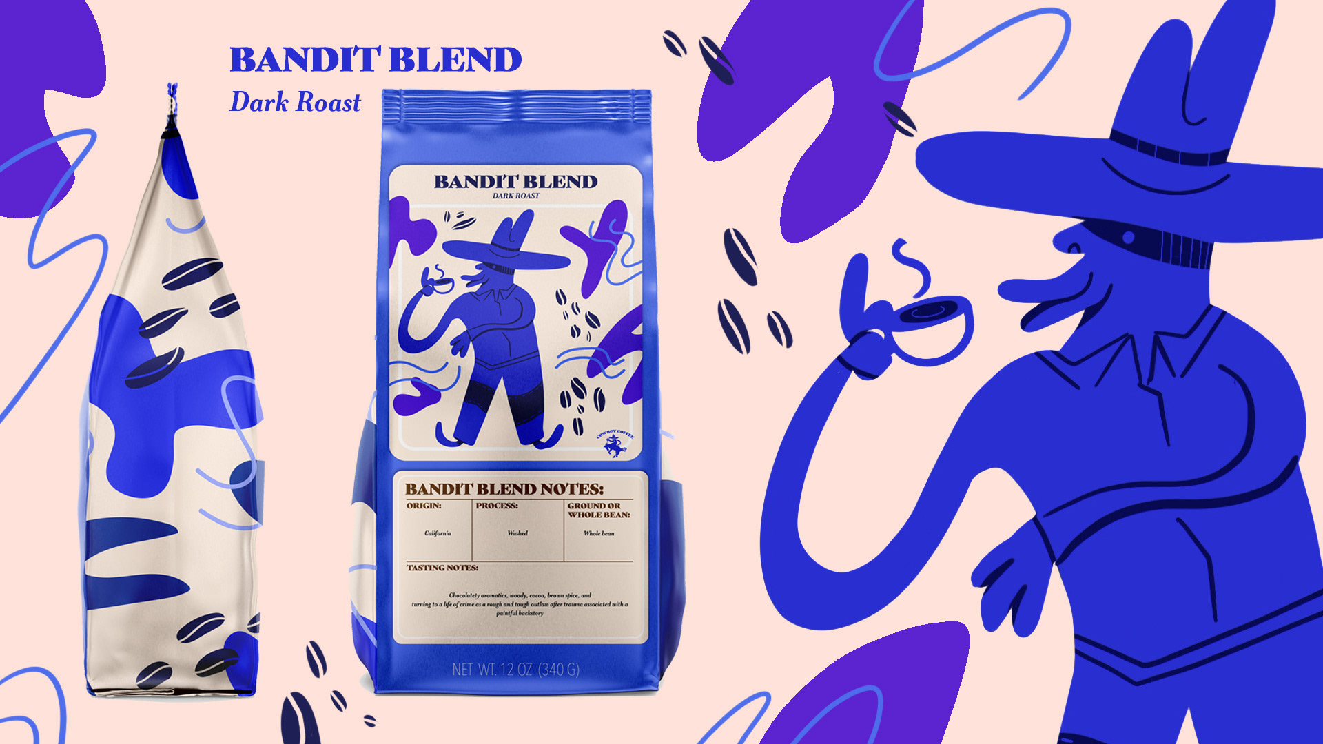
Most of my ideating happened in Procreate. I took the sketches I was happy with and brought them into Illustrator. I solidified the concepts and then cleaned up the line work to get a fun and simple feeling.
![](https://cdn.myportfolio.com/8414dadd-0bd1-436d-8fae-bae28eed6ffb/f44ea969-9628-427e-98c6-4afeb8bd21e2_rw_1920.jpg?h=3f002fc8e9a9f2250188b94579581508)
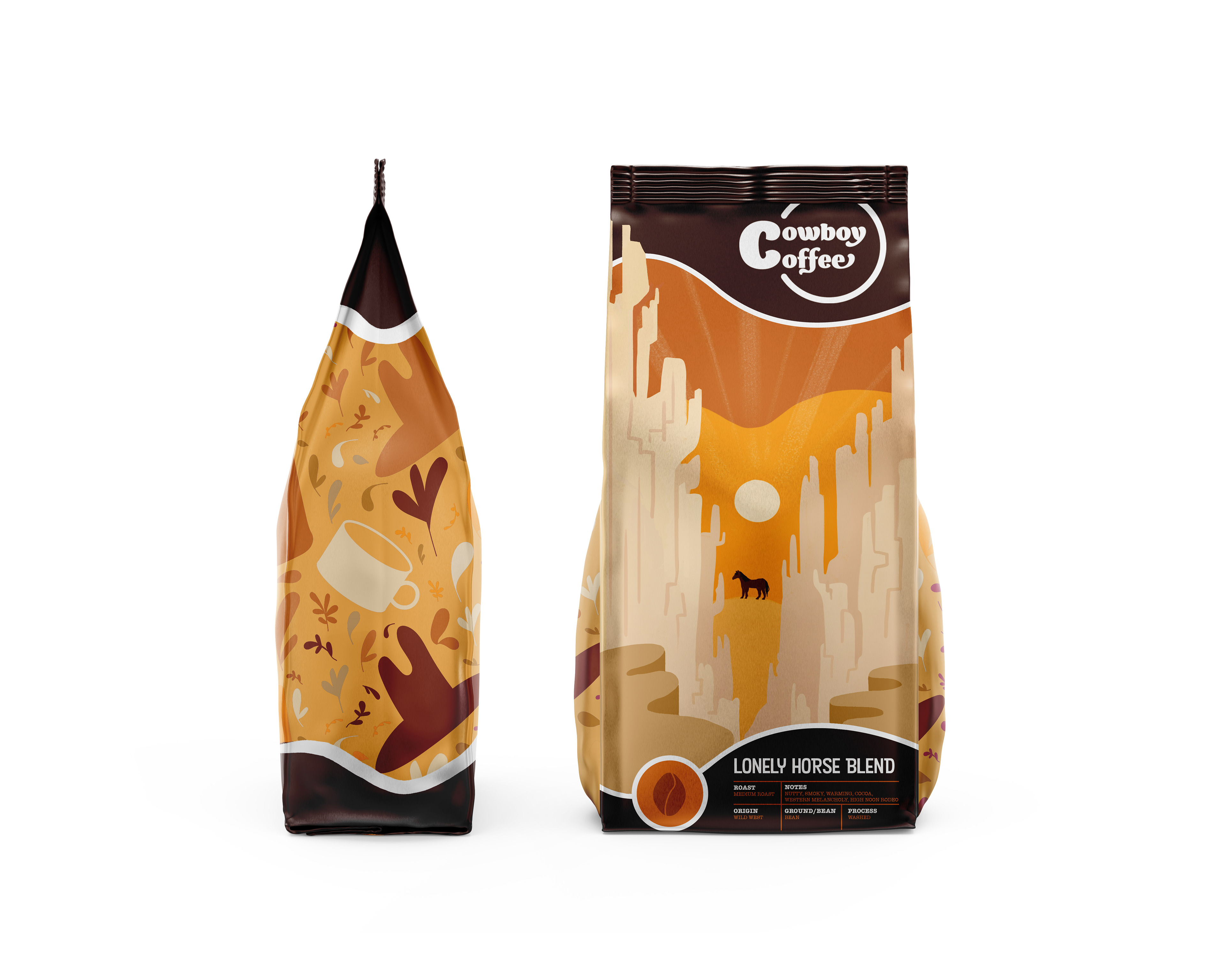
Backgrounds for these mockups were made in Photoshop. To keep a consistent presentation, I just utilized the same design motifs that I used on the packaging.
![](https://cdn.myportfolio.com/8414dadd-0bd1-436d-8fae-bae28eed6ffb/c4e8145f-57d8-4ba2-8ac9-3a105c7caddb_rw_1920.jpg?h=e124ba98c61209d60b948f1a0e86bc36)
![](https://cdn.myportfolio.com/8414dadd-0bd1-436d-8fae-bae28eed6ffb/8447e572-12c3-4b64-a9cd-c13e4ec2c259_rw_1920.jpg?h=9798f1fbf788e076a1c635950d34ecf2)
![](https://cdn.myportfolio.com/8414dadd-0bd1-436d-8fae-bae28eed6ffb/653e5a61-0231-49cd-a023-7658d825b8d0_rw_1920.jpg?h=b27a49f7b7ab7d20ed1f792974d6674d)
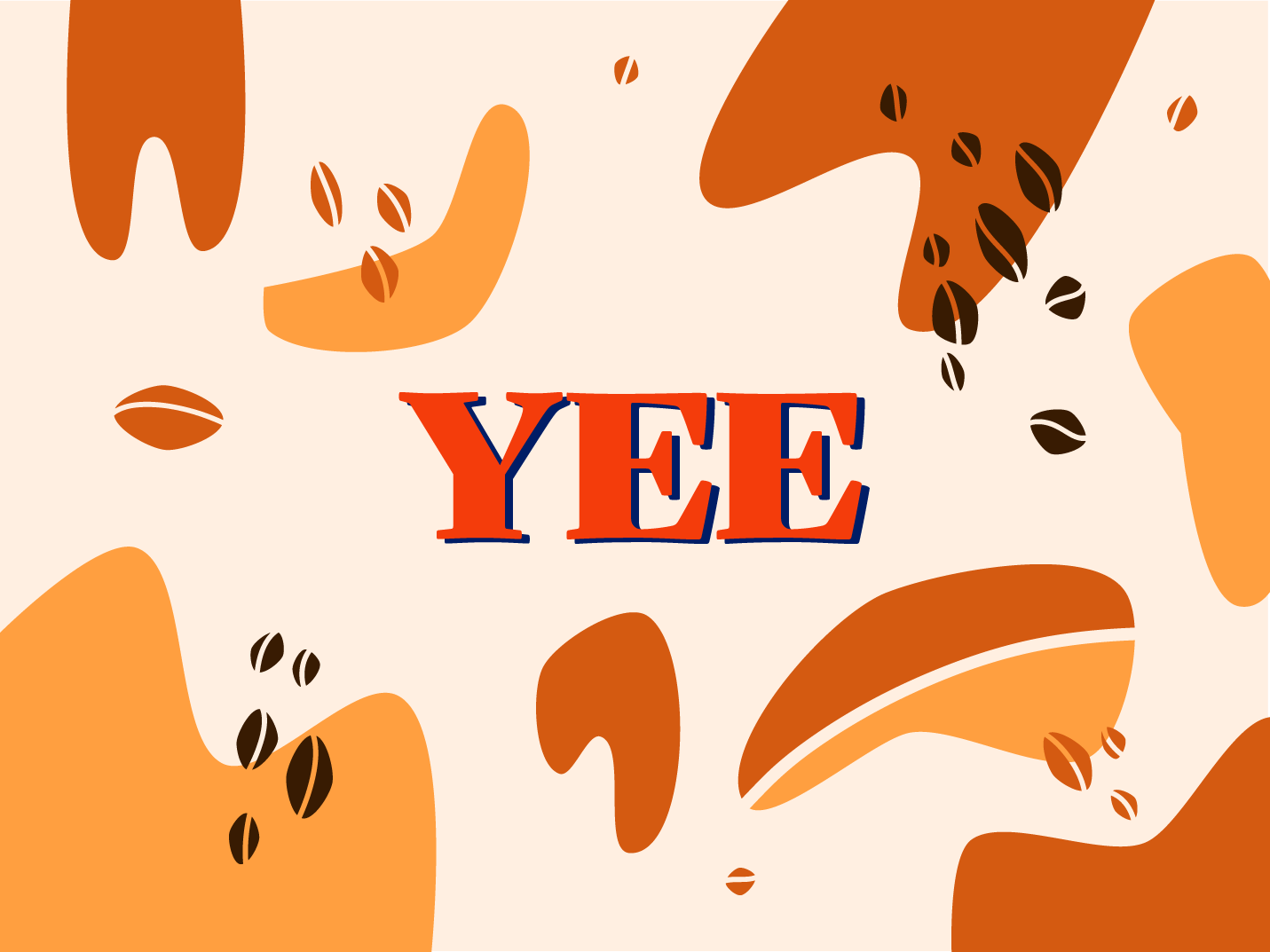
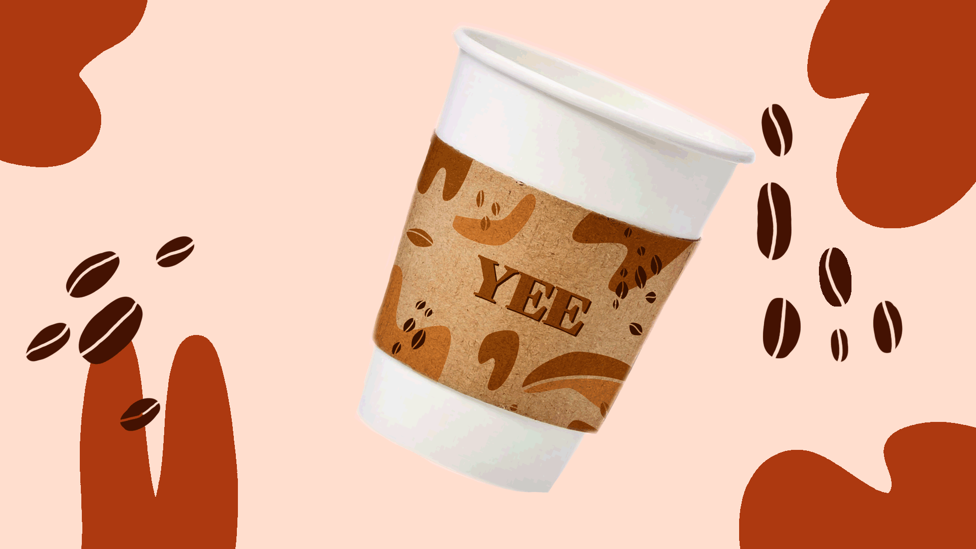
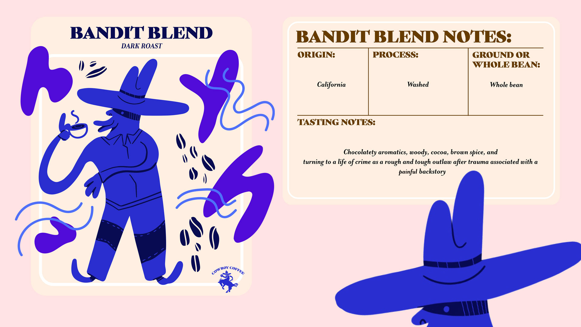
The cup holder design (pictured below) was done in Illustrator with a fully realized color palette. This was toned down in Photoshop to obtain a more cohesive look on the mockup product. (Note: The other side says, "Yee")
![](https://cdn.myportfolio.com/8414dadd-0bd1-436d-8fae-bae28eed6ffb/67856dfc-ca6b-4749-87d9-0f37d7b0f4c5_rw_1920.png?h=d8a2b9566ebaaadc17c53589ba0ed795)
![](https://cdn.myportfolio.com/8414dadd-0bd1-436d-8fae-bae28eed6ffb/d6beb1b1-7500-4f30-b30b-3d3ed088c59c_rw_1200.jpg?h=753193f905741715b2b907d3b760564b)
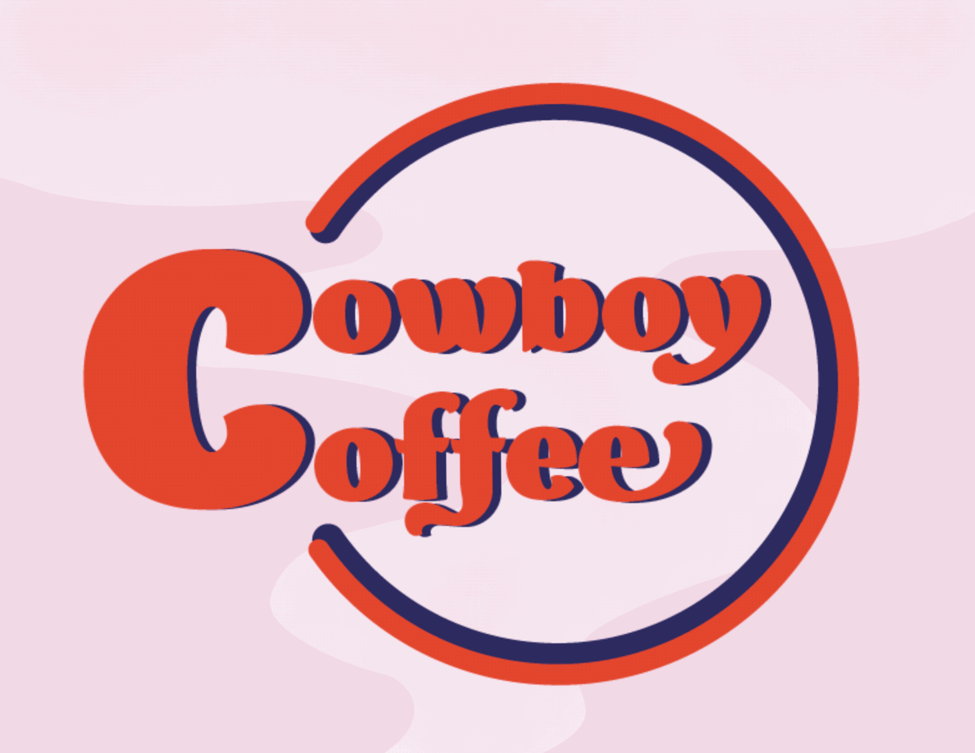
Simple animations, like the one pictured below were done in Photoshop. The logo animation was completed in After Effects.
![](https://cdn.myportfolio.com/8414dadd-0bd1-436d-8fae-bae28eed6ffb/4e36beb9-ec59-497d-a4d0-b600b1438ad5_rw_1920.gif?h=0d2b2beba9fb6041bc90f3dbed90bba2)
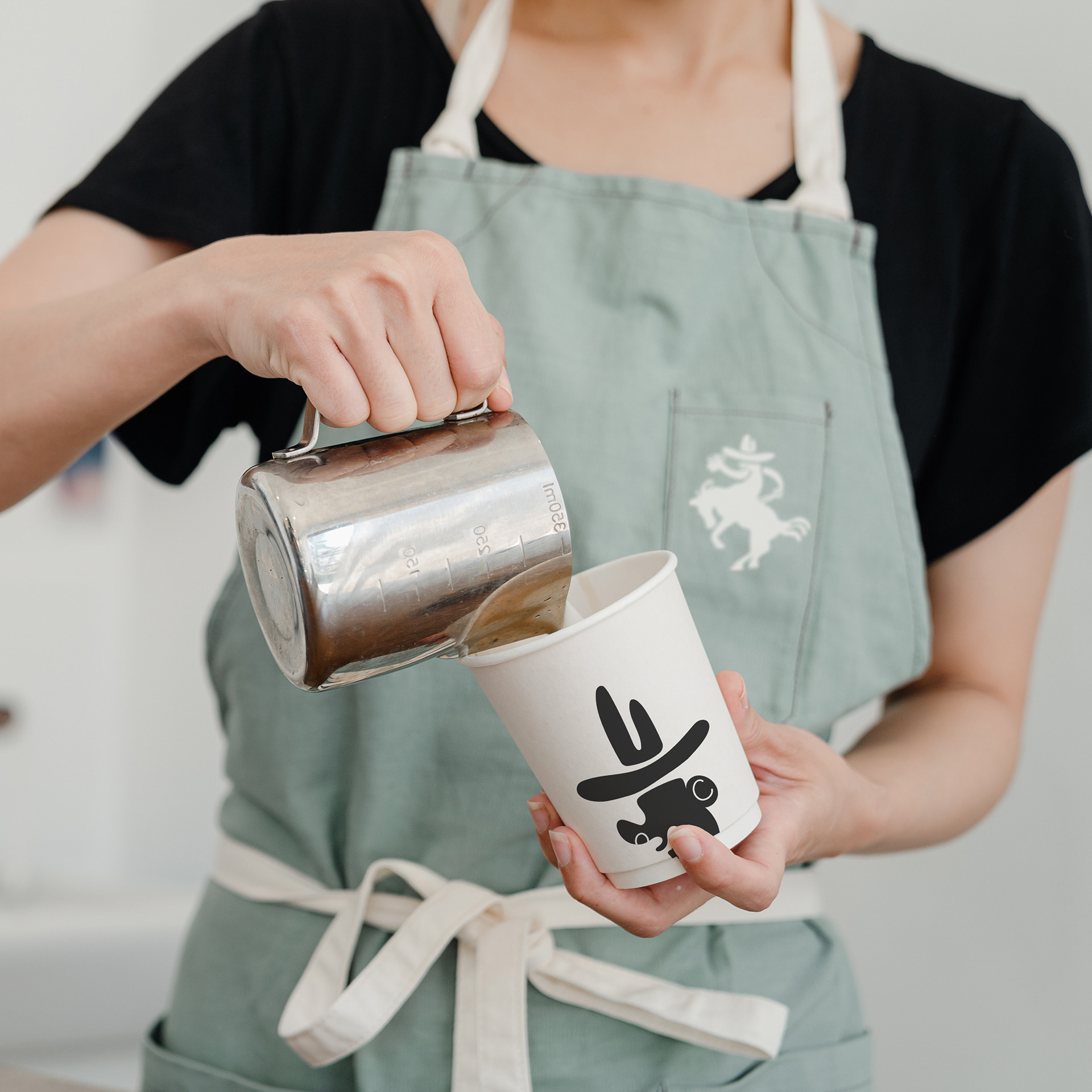
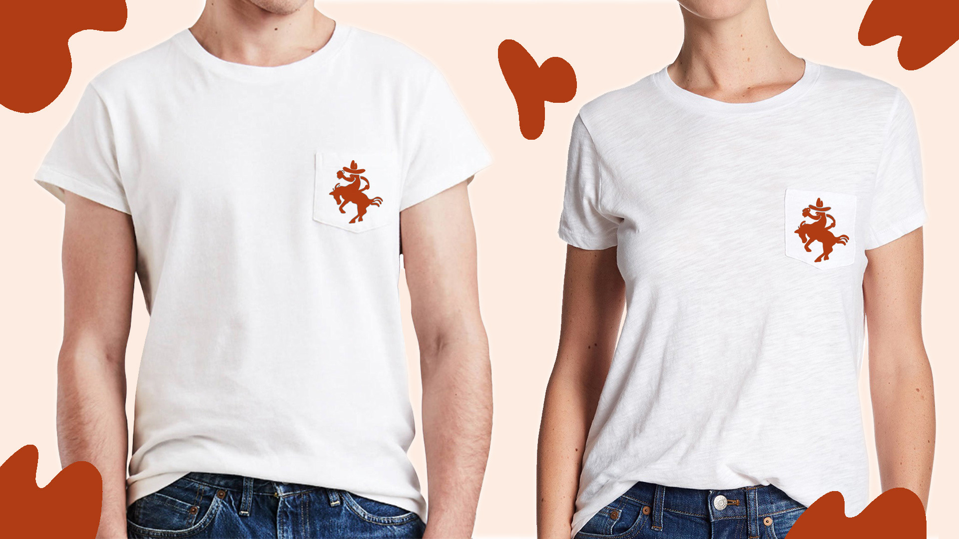
One of my favorite coffee shops in town has apparel that you can buy with the company logo on it, so I wanted to incorporate that into my project as well. Photo below provided by Ketut Subiyanto.
![](https://cdn.myportfolio.com/8414dadd-0bd1-436d-8fae-bae28eed6ffb/6fefdcd7-8992-4fde-b393-da41f427722a_rw_1920.jpg?h=75f6545ff28845a4475627be439bd5cf)
![](https://cdn.myportfolio.com/8414dadd-0bd1-436d-8fae-bae28eed6ffb/8605dfb0-eb11-42a8-9c74-8e5a2e6b1fef_rw_1920.jpg?h=39095a0d72758603e0bac29d7b4d6f8d)
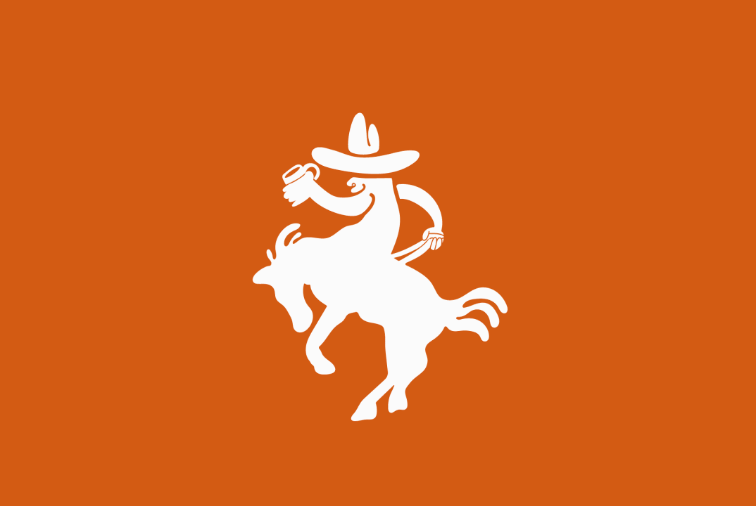
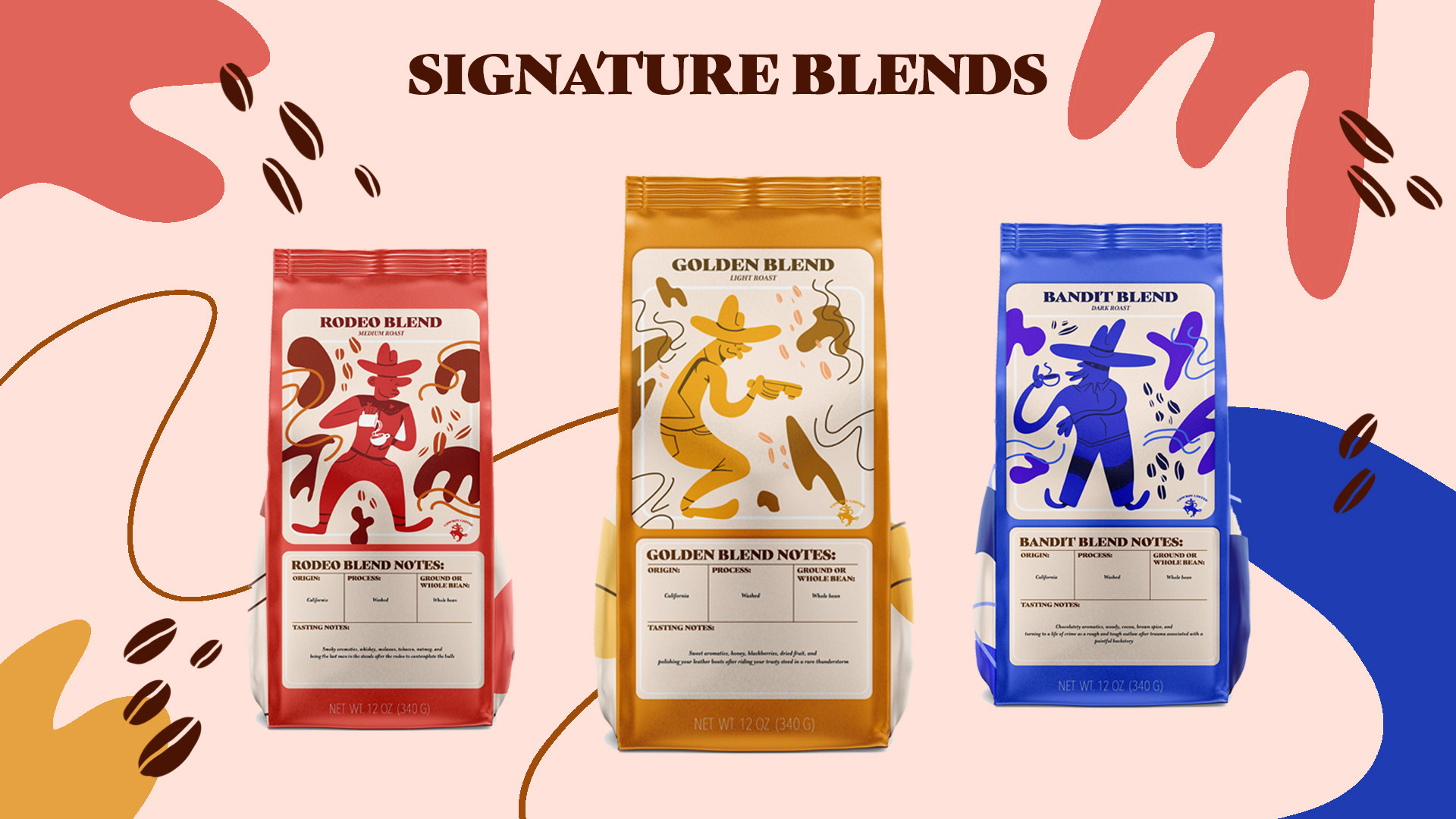
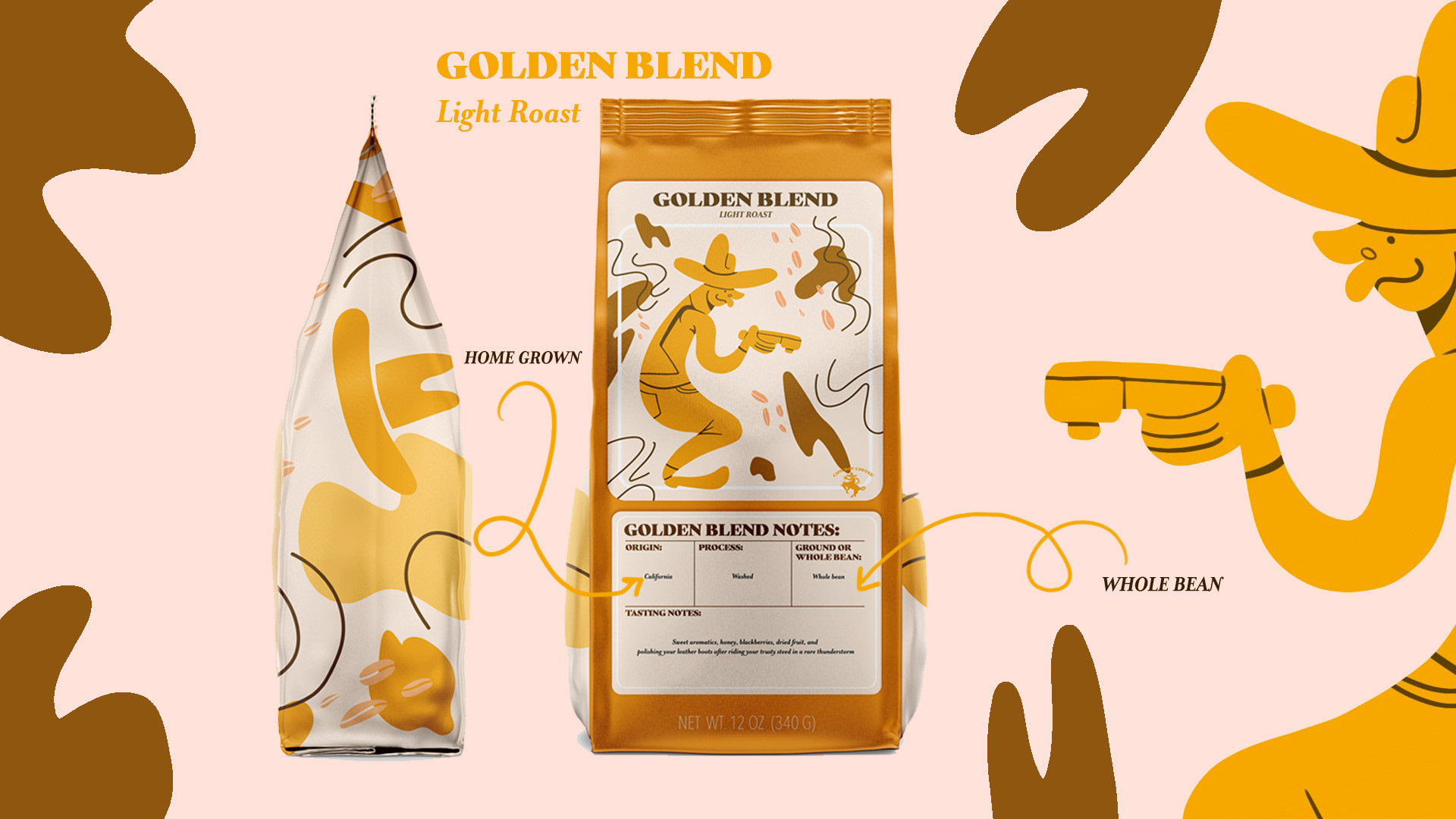
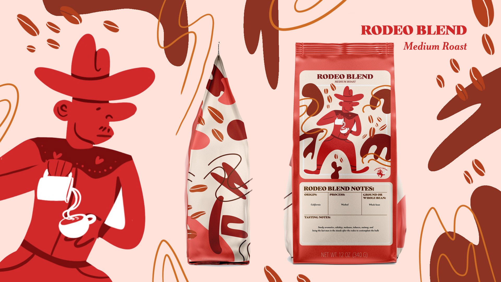
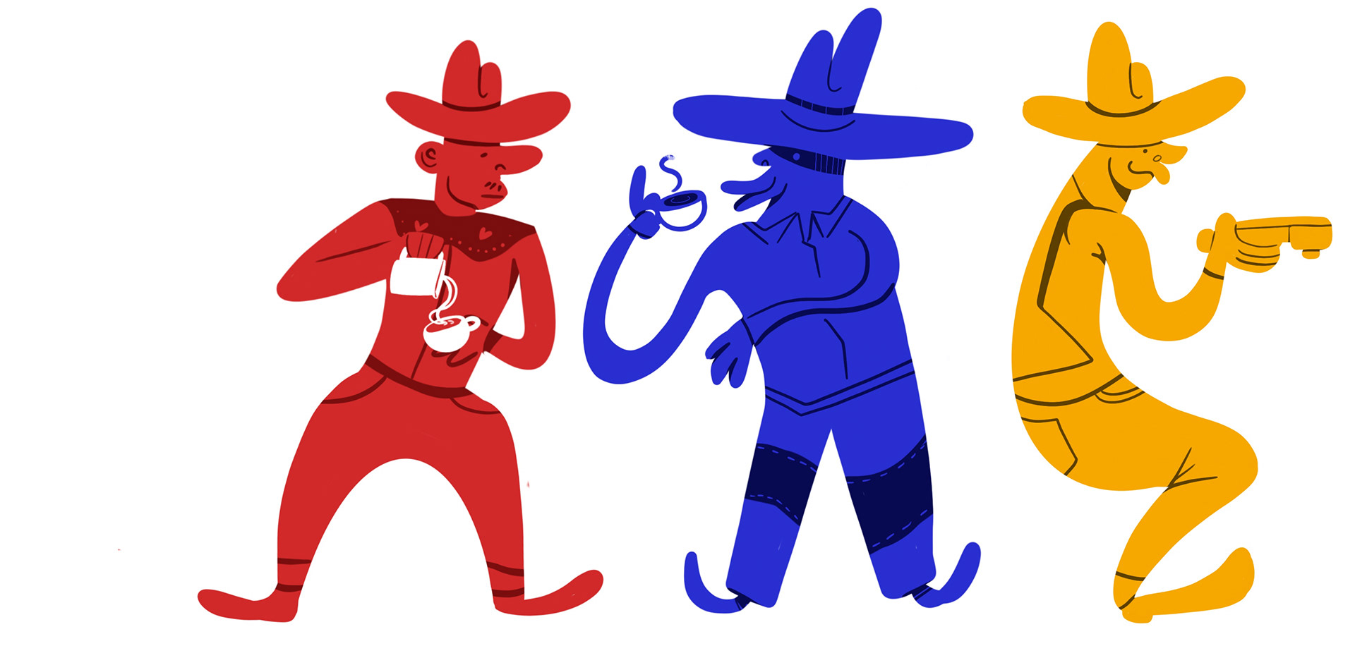
The characters were drawn in Procreate to get a loose and organic look. They were then converted into vectors in Illustrator, along with their labels.
![](https://cdn.myportfolio.com/8414dadd-0bd1-436d-8fae-bae28eed6ffb/978f3ddf-f3d2-4d86-b4fb-710dbe1391d3_rw_1920.jpg?h=6126fdadfe3dd391635d1f49547f5986)
![](https://cdn.myportfolio.com/8414dadd-0bd1-436d-8fae-bae28eed6ffb/2f723f02-e739-400c-808b-aca2cb4c9e65_rw_1920.jpg?h=b1084fb7e70d68741ca57a3bb4c3b3cb)
My initial concept (pictured below) aimed to combine some modern design aesthetics with some vintage color palettes and type settings. However, I found that my products and logo lacked cohesion. After (literally) going back to the drawing board, I found that simplifying the packages while having more fun with the logo, resulted in stronger visuals. As a result, the ideas pictured below were scrapped entirely, but it's still fun to look back and see how much this project grew for the better!
![](https://cdn.myportfolio.com/8414dadd-0bd1-436d-8fae-bae28eed6ffb/9b334c5c-88c9-471d-be87-58484b93a563_rw_1920.gif?h=cc11bd4b7133c516099ec2afe0569b7d)
![](https://cdn.myportfolio.com/8414dadd-0bd1-436d-8fae-bae28eed6ffb/9b92f067-27ba-45e4-b5b5-01dab05c1d74_rw_3840.jpg?h=a90238b419c28220b34852106512b3f2)