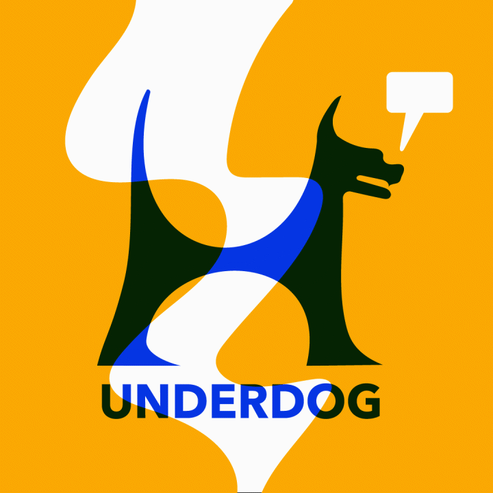
The image pictured left is a variation of the final logo which can be seen below. This image was used as the first post for social media to soft launch the Underdog brand. The heart, bridge, and hands are symbolic of what separates Underdog from regular marketing consulting business, as it emphasizes fostering relationships between young entrepreneurs and recent graduates with minimal professional experience.
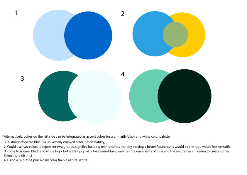
My initial task was to develop a strong color palette for their brand. I had decided that my initial thoughts (seen to the left) were a little too desaturated to be appealing to their younger demographic. After getting feedback, we opted to go for option 2 but to go just a little bit bolder and to scrap the green. We also wanted to try and see what the darker green might look like paired with the logo.
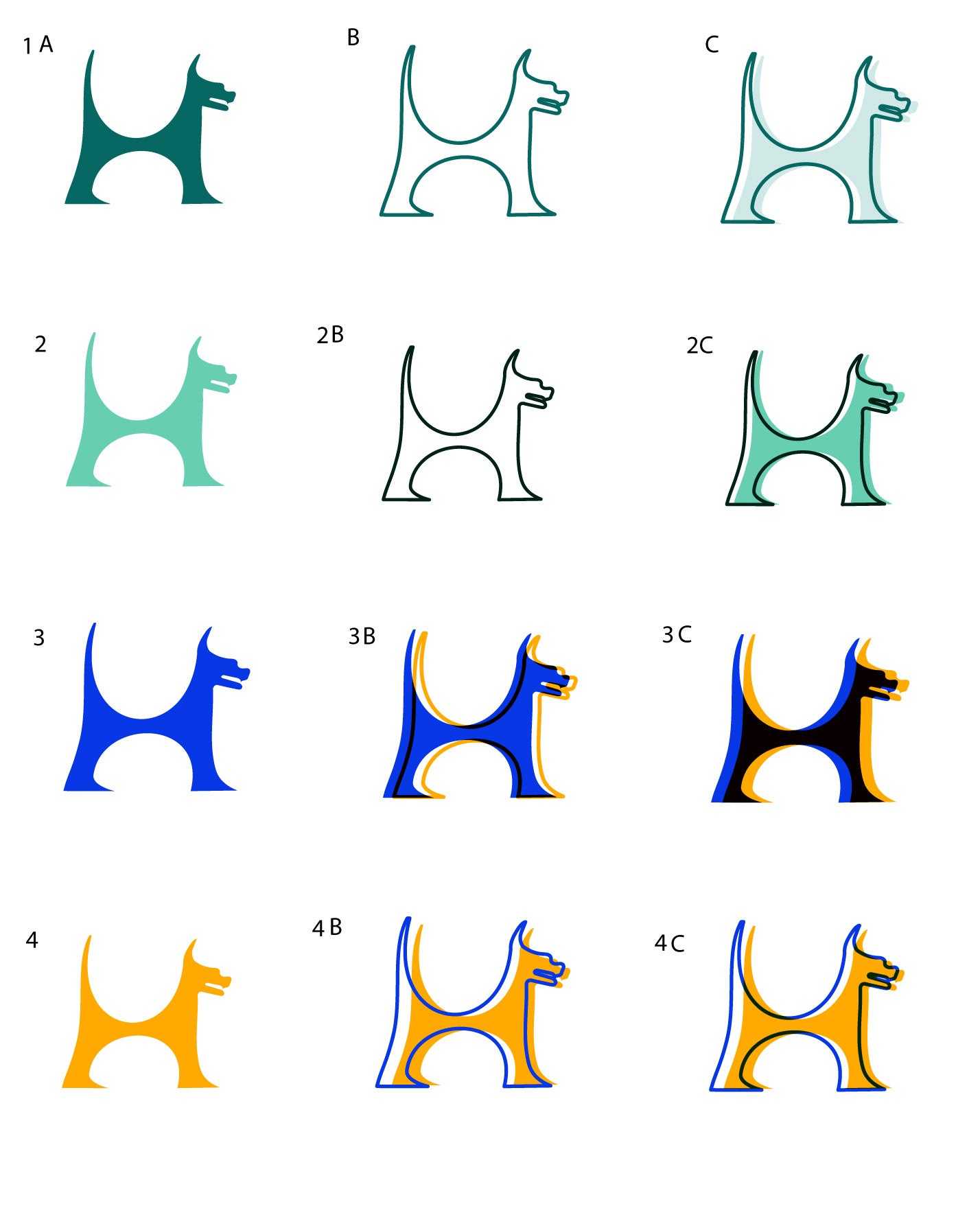
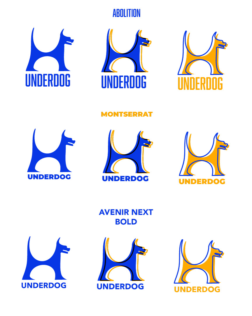
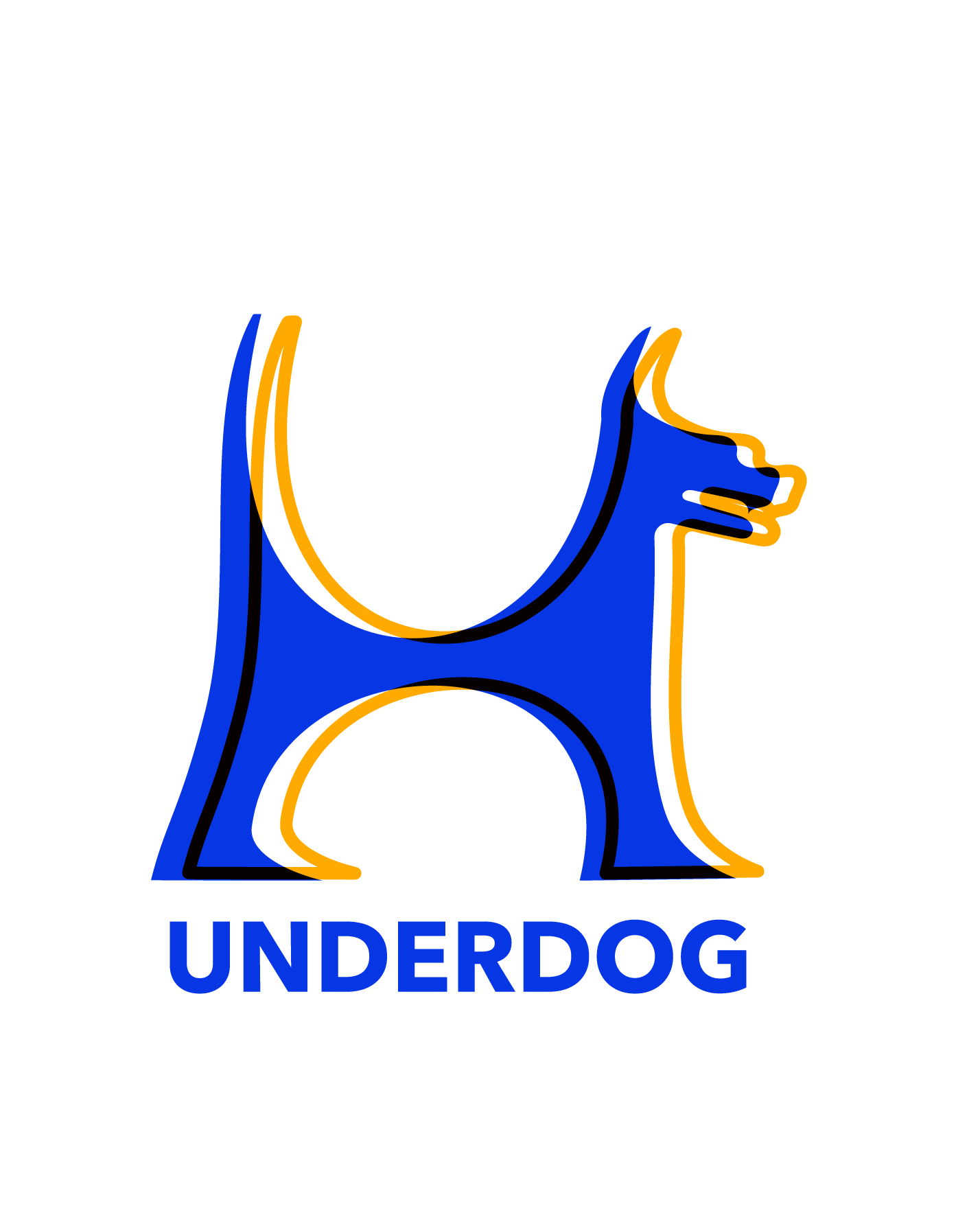
What resulted were the variations seen below based on the sketches I completed. The curves of the dog were intended to represent the bowls of a "U" and "D." After careful consideration, variations 3, 3B and 4B for selected to move forward, with option 3 being used as the final logo, as it provided the most clarity. The latter two options would be used for more fun and playful ventures on social media.
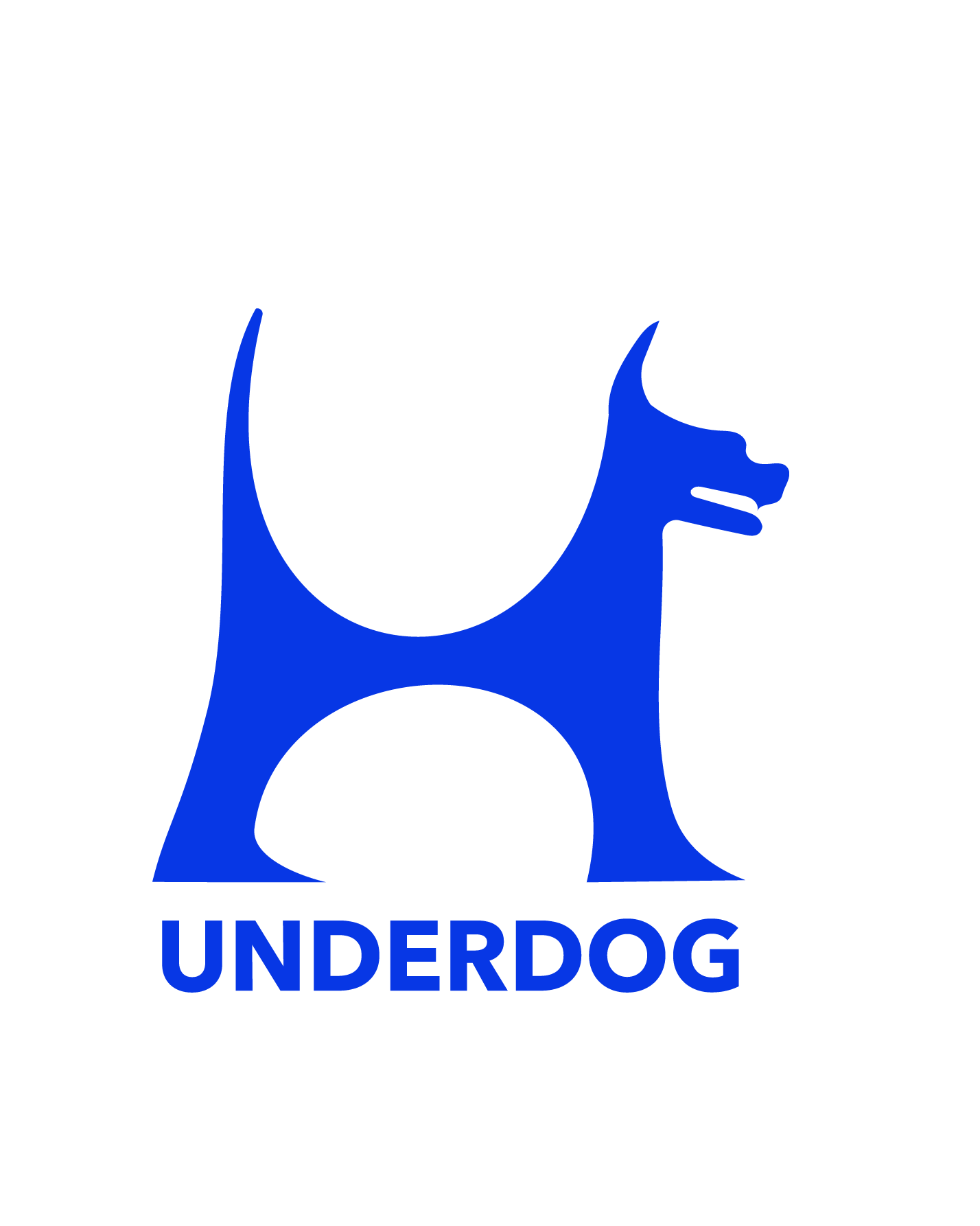
These are the finalized designs.